While we love to stay in the incredibly measureable realm of the online world, we know that many websites need to fuel action in the real world. As I’m putting the finishing touches on my new book, I am faced with the design that will make my book easy to recognize, easy to describe, and easy to buy.
In the book business, there are two conversions: convert an searcher into a finder, and convert a finder into a buyer.
We’ve already named the book Your Customer Creation Equation: Unexpected Formulas of The Conversion Scientist. Now it’s all about presentation.
My preference will be a white cover with hand-drawn elements and a picture of me. Here is a crude mockup The drawn images are just for placement, and I’ll want to work with my cover designer before doing any drawings.

What do you think? Please let me know in the comments.
There are are some guiding principles I used to come to this collection of elements, many of which you will find in the book when discussing website development.
Here are my guidelines and some examples.
Show the Product
Tim Ash shows a sales funnel on the cover of his book.

In the case of my book, I am the product, as teacher and co-creator of my readers’ digital conversion labs, so it might make sense to put me on the cover.

I don’t find many examples of this in the business book space, and this gives me some pause. However, given the personas I’ve written the book for, it may be a way to look unique in the space.
Encourage word of mouth
When a reader is recommending a book to another person, it is helpful to give them a way to describe the book.
“You really should read the conversion sciences book. I forgot the guys name, but it’s the one with the _________ on the cover.”
In the case of my mockup, they could say “…a guy in a doctor’s coat.” Of course that could sell a lot of books for Bill Nye, the science guy.

The book Presentation Zen might be “one with stacked rocks on the cover.”

Brian Solis book Engage is the “chain” book.

Express Your Brand
Scott Stratten is a funny, self-effacing, contrarian writer and presenter. He says on his Twitter profile that he’s “kind of a big deal on a fairly irrelevant soc media site which inflates my self-importance.”
His book, Unmarketing, is in a plain brown rapper, and looks like it was stamped instead of printed.

This is potentially one of the most powerful integrations of book and marketing, and can make your book instantly recognizable for your most engaged potential readers.
My brand centers around two memes.
Meme 1: The Lab Coat
I wear a lab coat in my presentation and photos. This will be recognized by many of my readers.


Meme 2: Hand-drawn infographs
I occasionally do hand-drawn infographs when at conferences. My book has some of these hand-drawn images in it.

I envisioned an entire lab in hand-drawn fashion, but haven’t had the time to complete it.
Emphasize the author or the topic?
After six years of writing and speaking as The Conversion Scientist, my business brand is much stronger than the book brand. One could argue that it makes sense to highlight my name more so than the book title.
However, I’m not established as an author, and I’m not a household name. People are more likely to be searching for the book title than to be searching for a book by Brian Massey, or the Conversion Scientist.
I could go either way on this one.
Use universal visual memes
Drawing from universal memes in the imagery quickly communicates what the book is (or could be) about. Philip Graves uses the universal sign for shopping, the shopping cart, over and over again in his book cover.

Universal memes for a book by a “Conversion Scientist” include the lab coat, the ubiquitous test tube, the Erlenmeyer Flask, the Bunsen Burner, and other remnants of High School chemistry class.

The chemical equation will either strike fear or recognition in the minds of potential readers.

I have a whole universe of conversion “elements.”

This is probably too over-the-top.
Own a Color
Groundswell owns lime green.

The “For Dummies” series owns yellow and black.

The Guerilla Marketing books own camouflage.

Avoid business porn
In all cases, I want to avoid what I call “business porn,” or the use of happy, beautiful people who inevitably are devoid of emotion and authenticity. Wiley has built an entire series with cover designs like this. The books are excellent. The covers are uninspiring.


The words should be readable
So easily forgotten in the design of covers is that the title and author should be readable. This means
- Avoid placing title and author on a busy background.

- Avoid placing dark text on a dark background. Gradients are especially bad as some part of the text won’t show up no matter which background you choose.

- Avoid placing light text on a light background

- Acknowledge that for aging readers, light text on a dark background is harder to read

- Don’t create font-confusion

Appeal to your readers’ tastes
Once you’ve identified these logical ground rules for your book cover, you can apply your readers’ preferences. This involves choosing designs from other successful books have done in your space.
If you get rid of the business porn, I like the simple design and white background of the Wiley Hour a Day series, and those readers interested in my book have bought lots of books in this series.

I like the had-drawn style of several recent books, and I have some ability to draw a cover such as this.


Stay tuned for the final cover art
I’ll be publishing in less than 30 days, so you can see my final cover.
I’ll notify you wen the book is out if you become a friend of the author. You’ll also get a free video to help you determine your unique site formula to increase conversions.
Talk to me. Comment below.
This is the first concept from the designer. What do you think?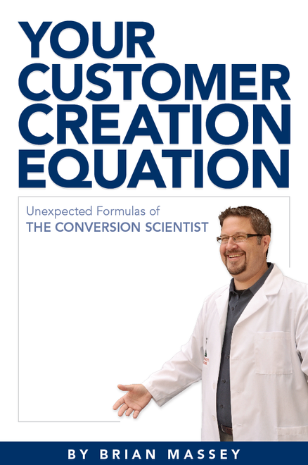
I like it! Only thing missing for me, is some doodling in that big white space of something that looks like a bunch of formulas – or doodles pulling together customer lifecycle steps. You’re a doodle man – doodle a bit. The title font is is hard to read for me… it looks like a big blue box of letters. I like the emphasis on YOUR. The subtitle could incorprate your website colors. Anyway, my 2 cents. Can’t wait for the new book to come out!
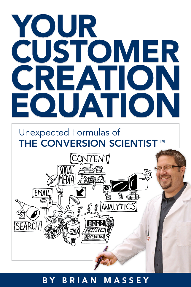
How’s this?
Loved these insights, thanks!
I’ll take a stab at this one. I don’t usually like doing design critiques because I don’t know what the whole thought process was behind the design. But! Since you’ve shared some different approaches, I’ll run with one. 🙂
I’d say this needs to own a color. When it’s on the bookshelf (physical or virtual), blue is easy to overlook. It’s just such a common color.
I’d definitely try something bright. If you could do a bright green or orange not too far off brand, I think that would work well. I personally find orange spines catching my eye time and time again when I’m browsing in Barnes & Noble.
Some attractive orange-spined books:
Freakonomics
Linchpin
Made to Stick
Subject to Change
Predictably Irrational (well, blue and orange)
Getting Things Done
Getting to Yes
What I do like about the cover in particular is the large font at the top. It’s easy and quick to read. The “ATION” on the last two words look attractive next to each other and sound catchy.
I think your hand-drawn concept is neat too although I don’t know how that could get squeezed on there with your photo. Probably better not to place more than one visual concept so the meaning doesn’t get diluted anyway.
Hope this helps. 🙂
Naomi,
I thought it was important to “own a color” as well. Dan Ariely made Orange and blue work for him. If I do a cover doodle, the “whiteboard” look will be important. Orange copy on white maybe?
Thanks,
Brian
Honestly, there’s a lot of things about this that I don’t like. “Customer Creation Equation” is a mouthful to say out loud, and it’s too conceptual to really understand without thinking about it for at least a few seconds – not a bad thing in itself, except that the cover art, as is, doesn’t help facilitate understanding, and neither does the subtitle. Although all of it reinforces your brand, it takes too long to figure out what the book is about, which will cost you the sale.
If you want to keep the main title, I think your cover art needs to do a much better job bridging the gap between that and what it is they’re going to learn. It should be an EQUATION that has the elements that go into customer on one side of the equals sign and the product of those elements on the other. So they can see (to use an oversimplified example) blog + effective website = new customer.
Then the subtitle should be purely descriptive: “How to use your website to build and maintain a strong customer base,” or whatever. I agree that you want to reinforce your brand by including the words “Conversion Scientist” very prominently somewhere, but it doesn’t need to be in the title. For example, you could have at the top: “The Conversion Scientist Presents:” or you could have it above your name “By The Conversion Scientist, Brian Massey”, or you could put it in a separate space entirely (many books include quotations or other descriptive language on the cover).
And then, I think there’s a lot of options for the title which could communicate similar branding but without all the wordiness. Just brainstorming here, “The New Customer Equation,” “The New Customer Formula,” “Customer Chemistry” “The Customer Explosion,” etc. All of those could play into your brand, and as long as the art bridges the gap and the subtitle describes in detail what they’ll learn, you’ll be in good shape.
Just my opinion
Great feedback. How do we communicate what the book is about with the cover? I’ve tried to steer clear of the “Make money with your website” positioning. The book is about “How to make better decisions for a website that is very important to your business.” That’s probably a better subtitle with some wordsmithing.
You’ve hit the nail on the head with this: The cover graphic HAS to give some meaning to the title. No pressure! Thanks.
If you go for the handdrawn infograph I think it should illustrate the “unexpected formula”.
Here’s my tip: go to a bookstore, (if one still exists?!), Go to the shelf where your book would be. Ask yourself: – “What would make anyone recognize my book among the competitive ones that call for fo my attention here?!”
I did use my own library as a virtual book store. Many of the titles here are from that. I’ll go to a bookstore today and see what I see. Good idea.
Brian, you definitely have a talent for drawing. But for the sake of a business-related book, I think you’d be better off limiting the drawings to the inside of the book (much like For Dummies does). In each of the hand-drawn covers you cited, all of the titles are connected with the hand-drawn/visual essence of the book. I think it’s very difficult to successfully pull off a photo combined with hand-drawn material on the same page.
Scott, your point is well-taken, and if I can’t pull it off, we may go without the hand-drawn graphic. Thanks.
I like your picture. I like the colors, blue & white. i like that you got Conversion Scientist in there, but its not confusing. However, the limited palate of just blue & white coupled with the simple font make it seem cheap. I can’t explain how i associate one with the other (maybe all caps has something to do with it too?), but that’s what i’m thinking in the back of my mind as i look at it. Maybe use a different pose for you? I don’t know. I can’t come up with the ideas, I can only tell you what I think of them. I’m afraid that’s the unfortunate limits of my talents.
Erin, I certainly don’t want to look cheap. I appreciate you feedback. My book cover designer is supposed to come up with the ideas, so don’t worry about that.